EMPATHIZE & DEFINE
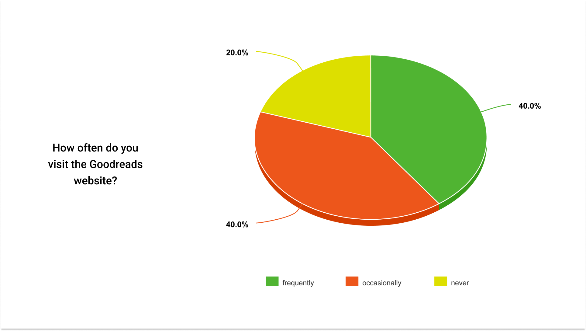
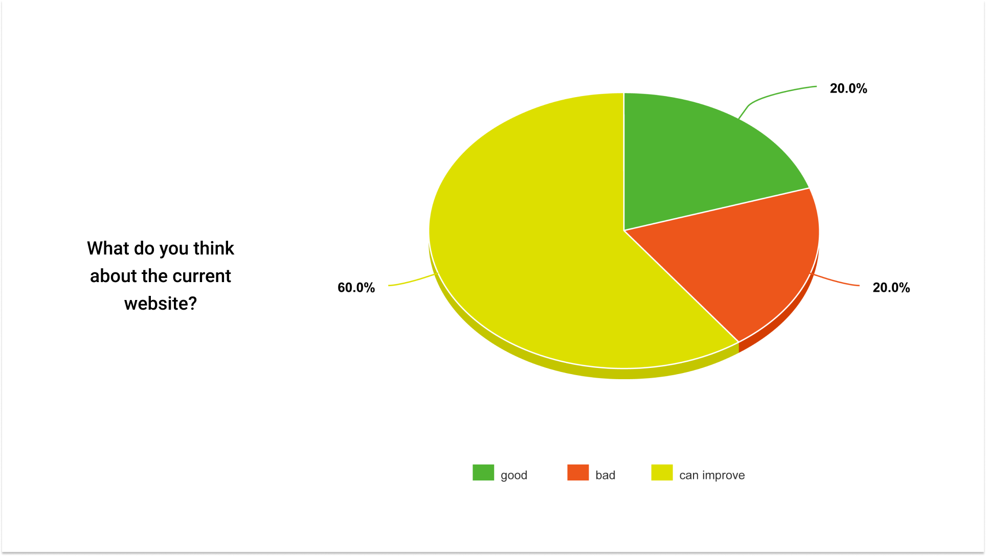
For this project, my target audience constituted young readers and Millenials. I wanted to understand what type of interface young people expect when they visit a website. So, for the research, I talked to five avid readers to document their needs.
PROTOTYPE
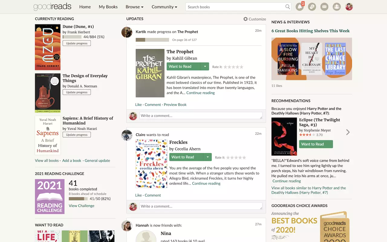
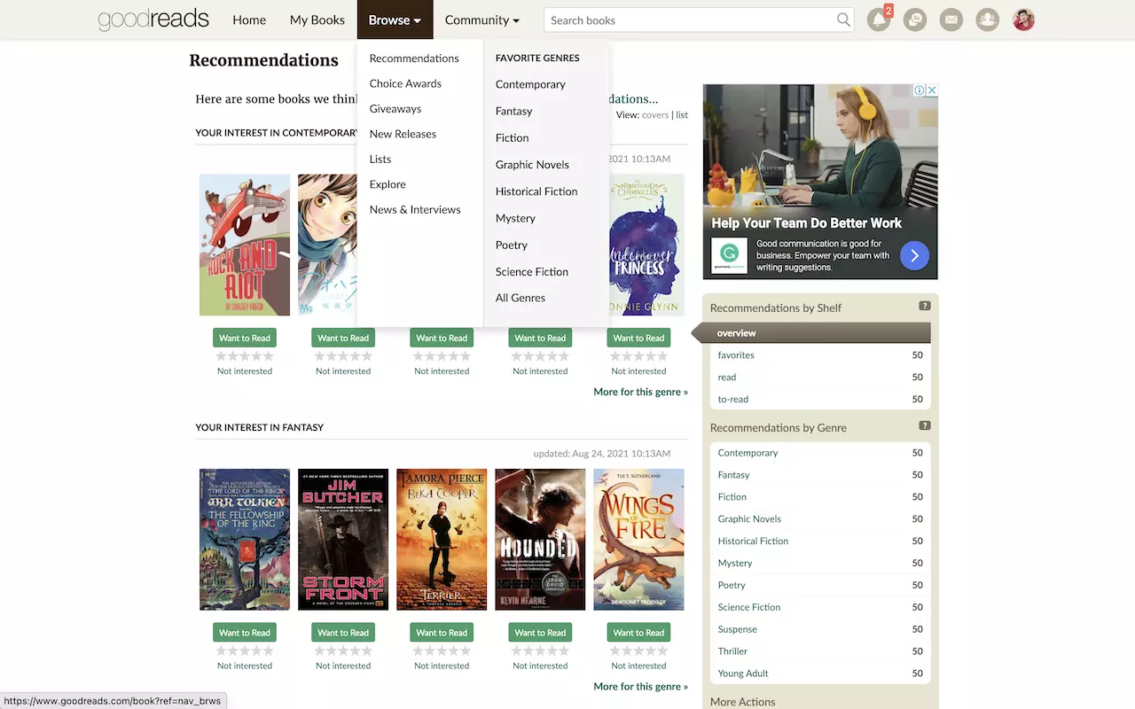
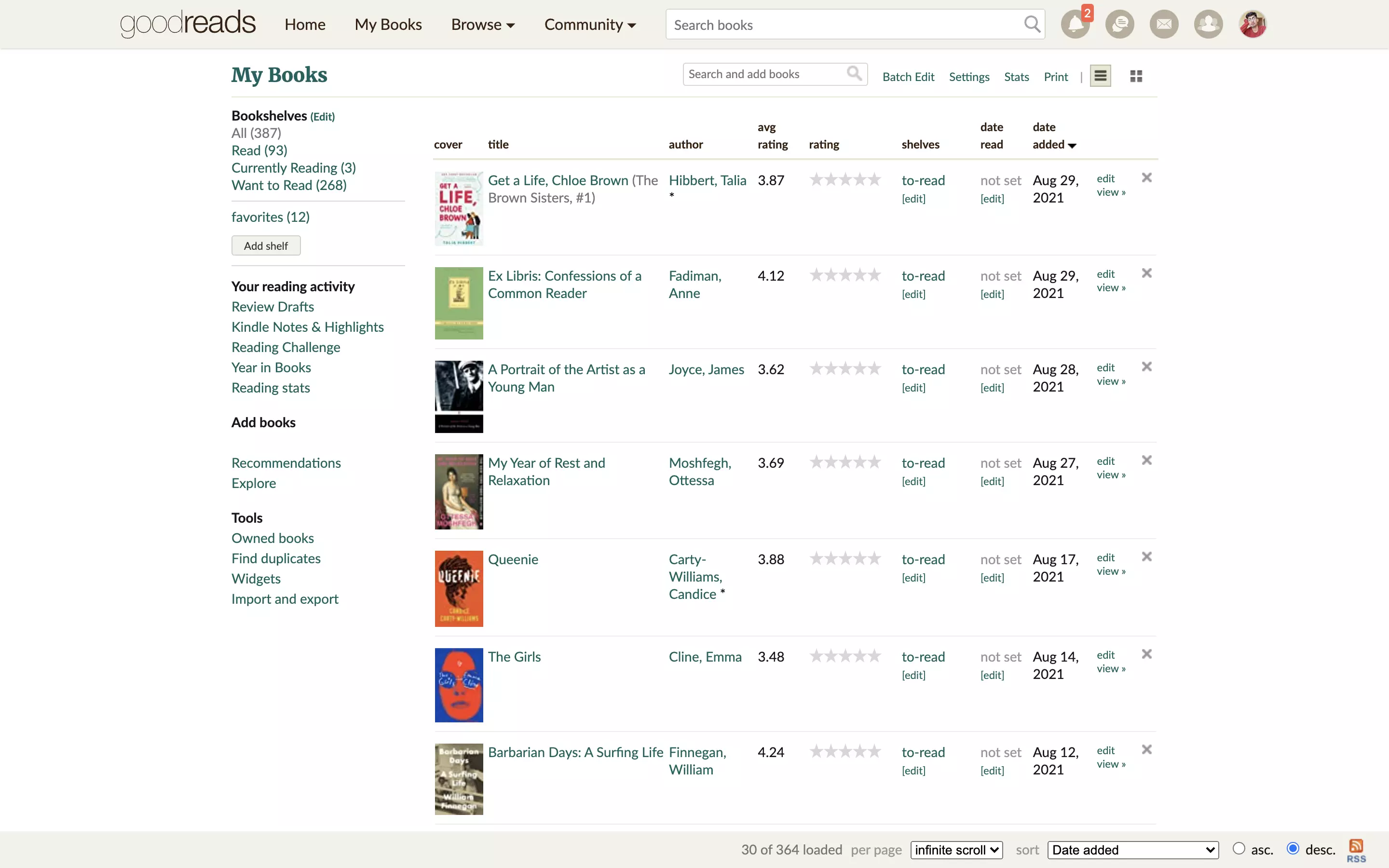
Current Website
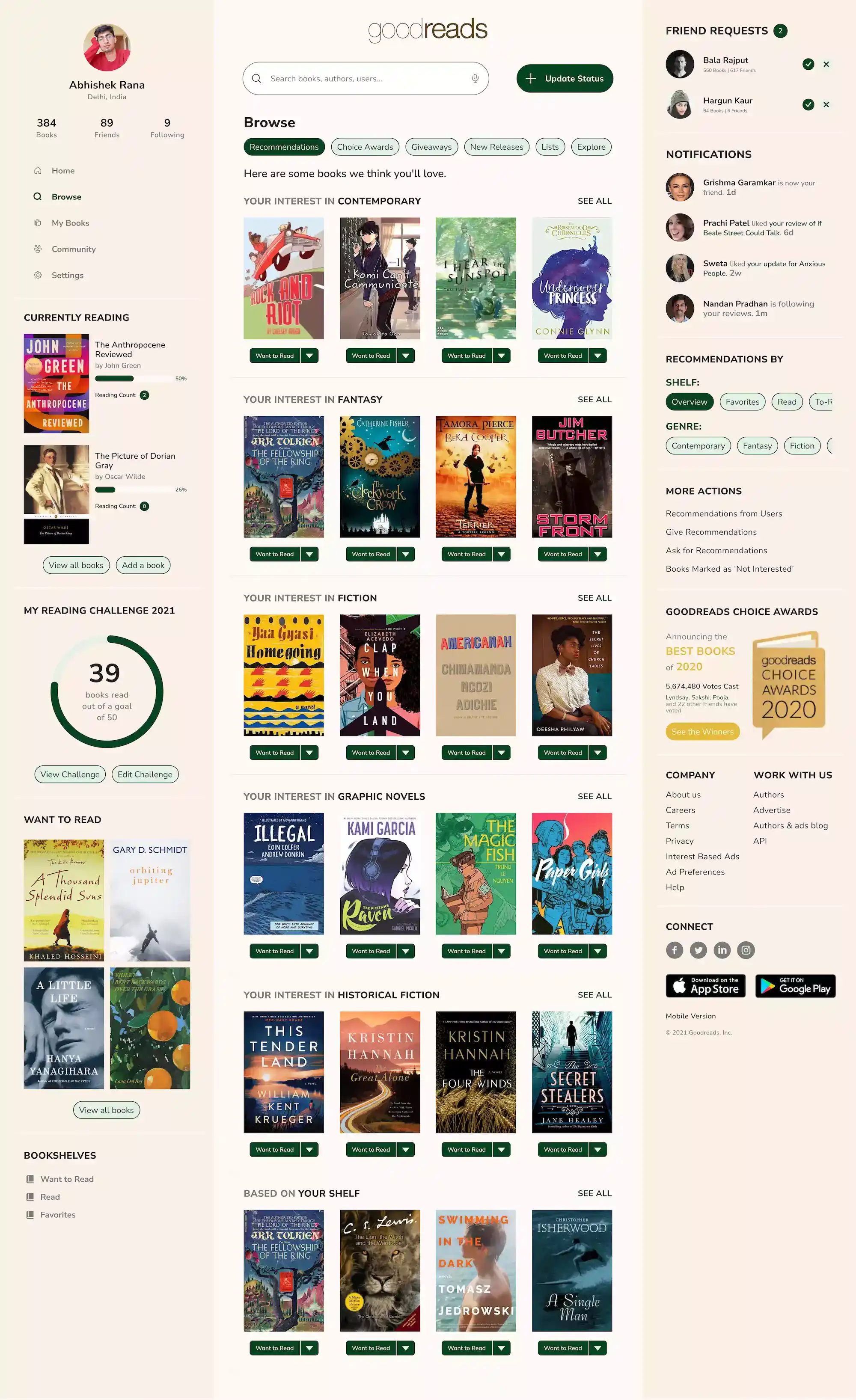
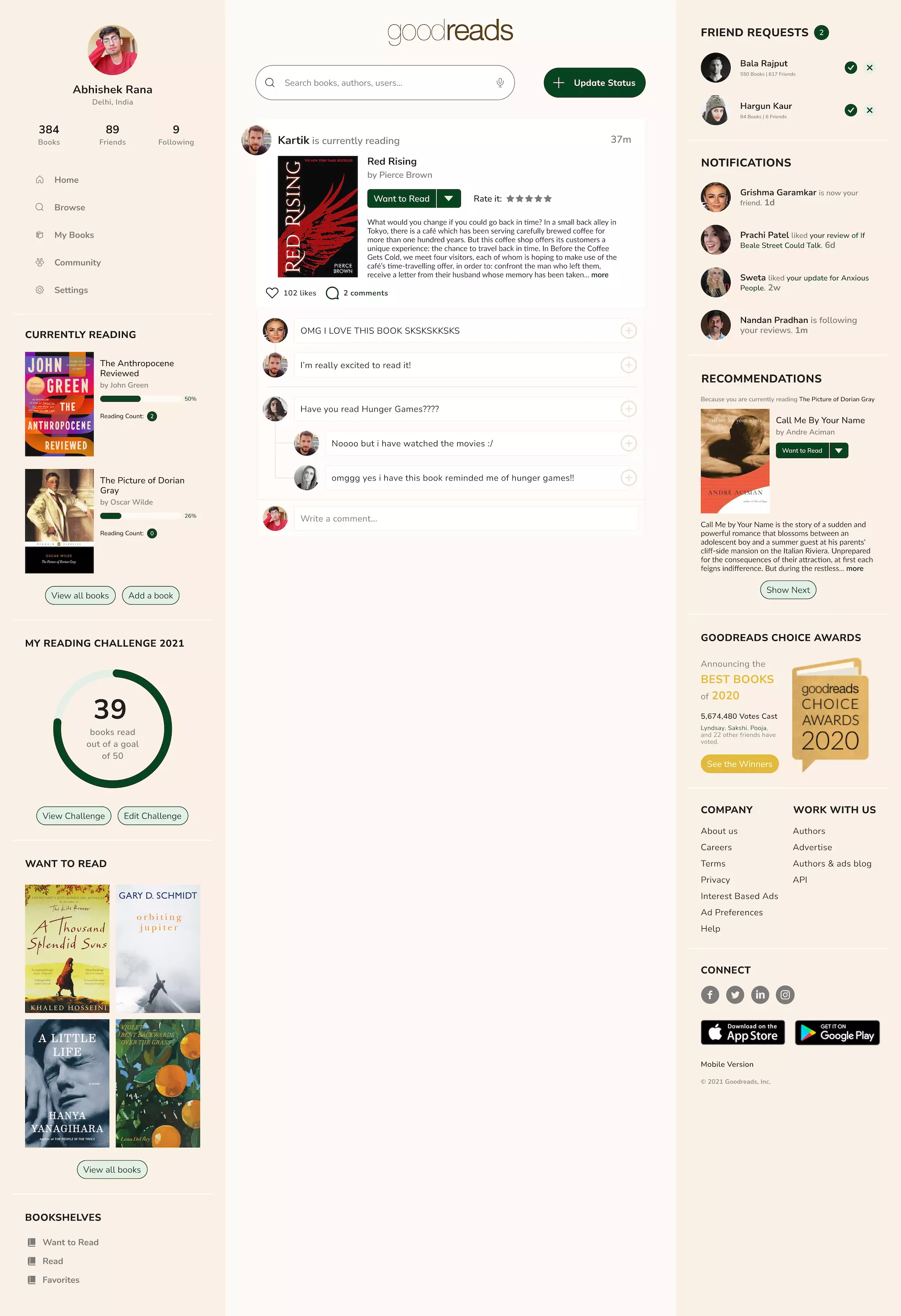
My Redesign

To tackle user frustrations, I utilized the already existing 3-column layout of the website and removed the top navigation bar.

The current recommendation page has an out-dated and hard-to-navigate layout so I simplified the filter menus and redesigned the UI.

I took away the spreadsheet-like layout from this page to modernize the look and make it easier to navigate.

One of the most frustrating elements of the current website is replying to a comment. I added a + button so users can easily leave a reply.
Takeaways
As an avid reader, this project helped me connect with other book lovers and explore different user needs within the same generation of people. This redesign makes the website usable and enjoyable while keeping the existing brand identity intact.

