RESEARCH
Secondary Research
- In the initial phase of my research, I examined the navigation systems and maps at various public spaces and institutions, such as museums, shopping malls, university buildings, subway stations, and grocery stores.
- I noticed that maps of most museums, shopping malls, and university buildings rely heavily on assigning numbers to different areas within the space. Grocery stores use different colors to differentiate between different food sections and aisles.
- I also attended a symposium, Making the Inclusive Museum, by the Architectural League. At this event, members of JSA/MIXdesign shared the MIXmuseum Study and the conflicting inclusive design challenges they faced at the Queens Museum. I skimmed through their research document, which guided some of my design decisions for symbols and museum maps, such as gender-inclusive icons, keeping linguistic diversity in mind, and avoiding the usage of too many QR codes.
Primary Research
My project centers on two categories of museum visitors, New Yorkers and tourists, as museums attract diverse visitors daily. I applied different observational research methods, such as photo study, think-aloud protocol, and behavioral mapping, to understand visitor frustrations and goals. I used the data collected from these research methods and secondary research to redesign navigation maps, signage and symbols, and artwork descriptions.
- Photo Study
I visited the MET to take photos of signage, maps, current exhibitions, and popular spots. After the shadowing method, I revisited my photo study to take more pictures to document observations made by my research participants. Later, I created a zine to present the obstacles, positive visitor experiences, and feedback.

- Shadowing and Think-Aloud Protocol
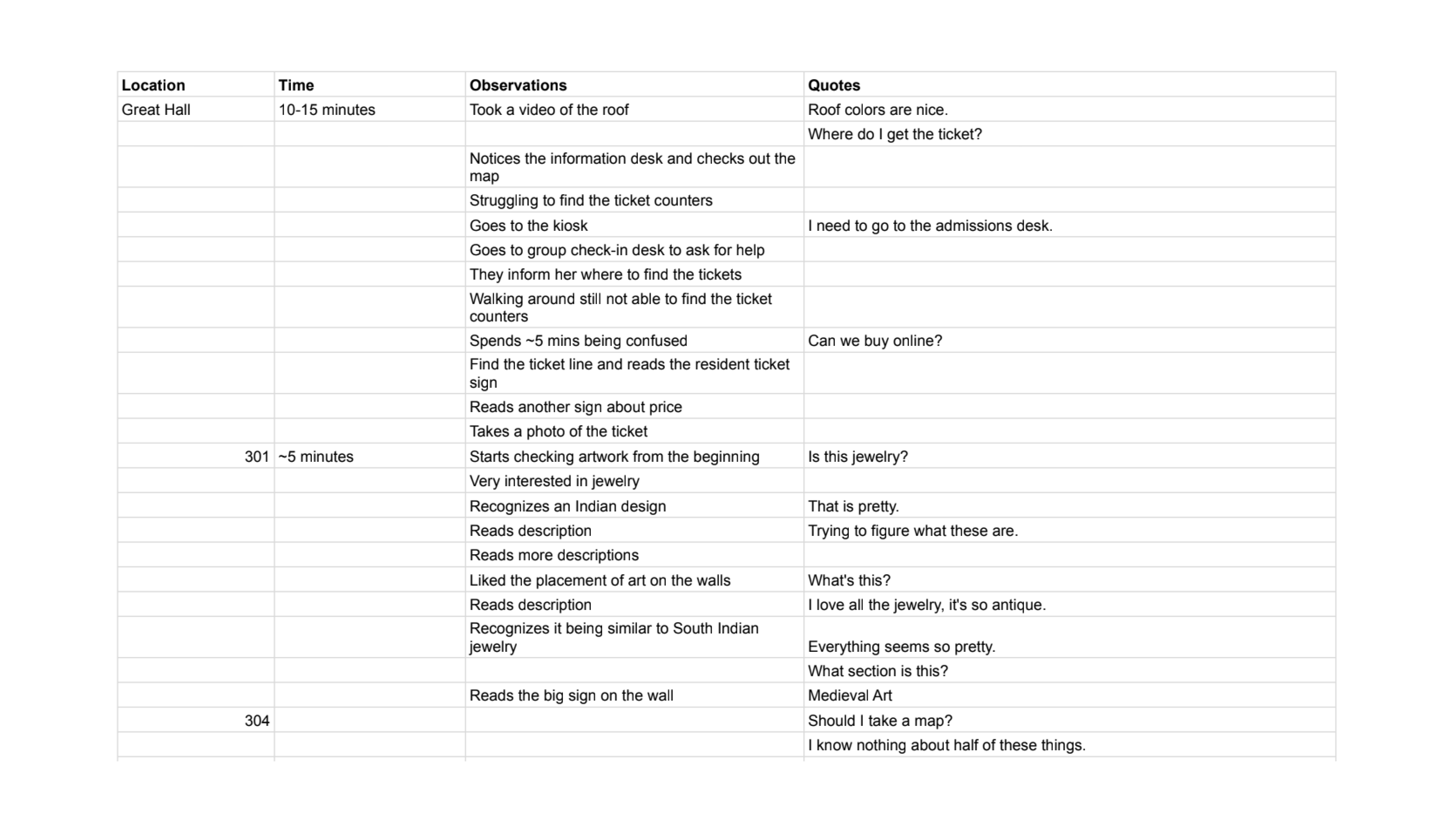
I recruited three first-time MET visitors to carry out the think-aloud protocol method. I visited the museum separately with each participant and asked them to walk around at their own pace while assuming I was their shadow. They were asked to describe their observations, thoughts, and reactions verbally. Meanwhile, I took notes of their experience. My note-taking method had five categories: location, time, observations, and quotes.
Observing visitors from diverse cultural backgrounds and artistic viewpoints was an exciting experience that made me experience the museum in a new way. I witnessed pain points I hadn’t noticed during my solo photo study visit. A shadowing method approach was a great idea as I could collect a lot of data, which I later used in different coding methods. Later, I used the data collected to lay out position and behavioral maps.
- Behavioral Mapping
The behavioral maps were used to identify which parts of the museum each participant visited and for how long. This helped me understand why each participant spent more time in one section than the others. In the follow-up interview, I learned that two out of three participants like to check out artwork or artists they are interested in or already familiar with. One also mentioned visiting museums to learn about her cultural history. One of the participants was an artist who likes to visit museums for inspiration and to check out new artwork or artists she is unfamiliar with.
- Position Maps
These position maps support my finding that visitors faced difficulty finding the ticket counter and spent most of their time with artwork that was most familiar to them or most inspirational.
Why Grey Art Museum?
NYU’s fine arts museum, the Grey Art Museum, has no maps or guides, which is something I wanted to design for this space. Even for a smaller space, I believe a map will be helpful and can work as a filter for visitors if they only visit for specific artwork or artists.
- It is a fine arts museum, which is something I find exciting and fun;
- There are enough areas and challenges (such as navigation, translations, and visual descriptions) for me to explore and try to fix;
- It is not too big, and the feasibility of developing an AR navigation system with cost-friendly technology will be manageable.
GOALS
The primary aim of this project is to make the visitors feel included in the museum experience and improve the wayfinding or navigation system. Through this project, I want to highlight the scope of cost-friendly and easy-to-use technologies to improve museum experiences. This project will provide a direction and framework for museums and galleries to apply to their spaces to offer an inclusive museum experience to visitors regardless of their socioeconomic, cultural, or linguistic background. Thus, I present enhancements that only require a smartphone to access all the information, museum maps, and wayfinding tools.
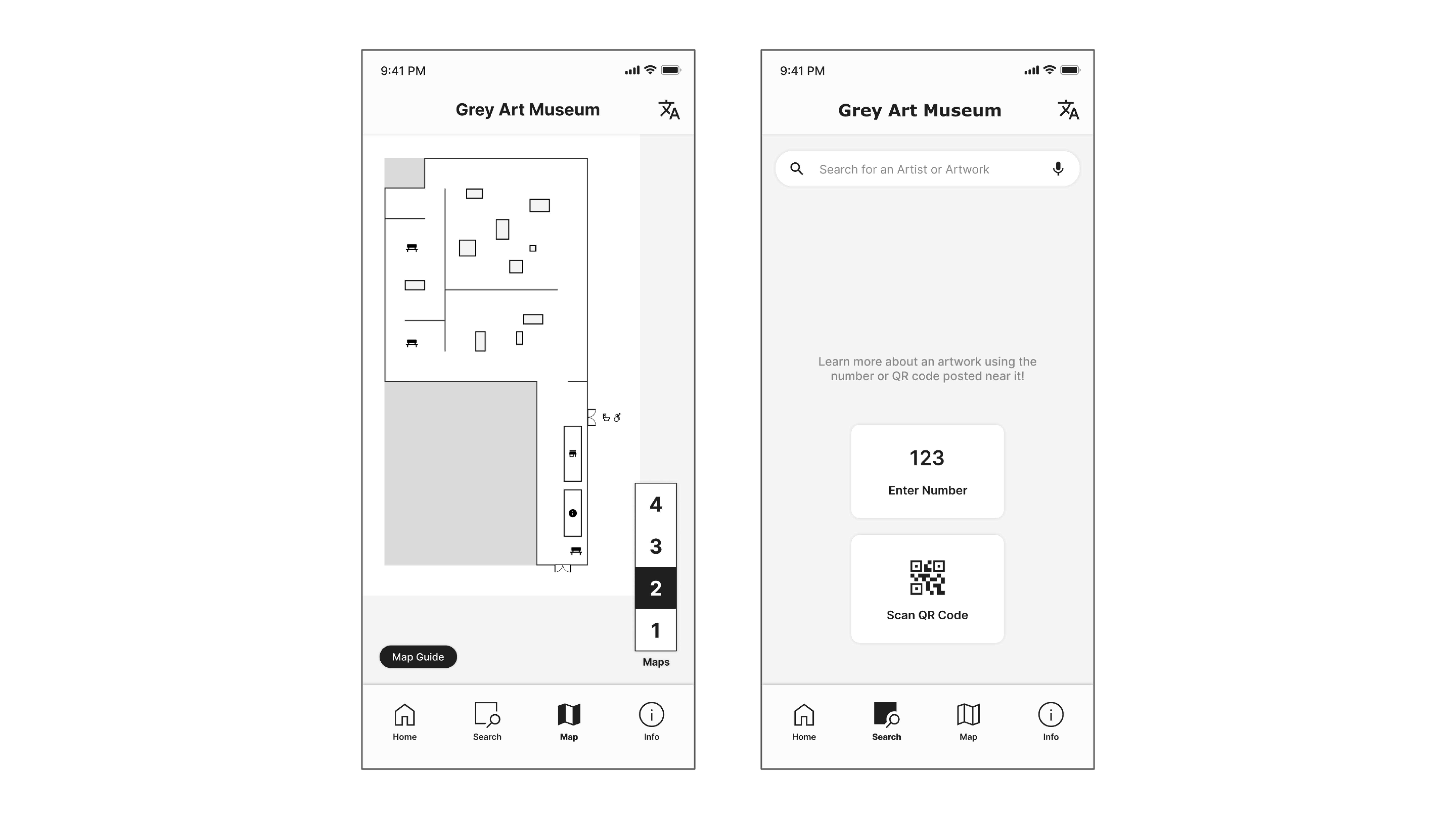
MUSEUM GUIDE
Translations
- The Grey Art Museum does not have tickets as it is free to the public, so there was no way to identify the most spoken languages by the visitors. I used the data from the NYC Consensus to determine the most spoken languages in the city and the neighborhood, as the associate director mentioned that most visitors are locals living in the neighborhood. Thus, I translated all the prominent description labels and nine artwork description labels into four languages: Hindi, French, Spanish, and Chinese.
- At first, I tried using language translation APIs (mostly Google Translate API because only that has all these languages available); however, after implementing them, I realized the translations were inaccurate. The major issue with the translations was that they lacked context and output literal translations that didn’t make sense.
- I was frustrated for many hours trying to figure out a way to fix this, and in the process, I forgot that my user is not technology but the people visiting the museums. Trying to fit my problem into a technological solution wasn’t the way forward. So, I realized the best user experience will be designed with the users, by translating the information manually. I translated a lot of the Hindi text myself, but eventually, I used ChatGPT-4 for my translations. I still had to verify all the AI-generated translations. The Hindi translations had no factual errors; they sometimes used different words to convey the same meaning.
- I chose French due to the exhibition's theme, i.e., “Americans in Paris,” while Spanish and Chinese are two of the most spoken languages in NYC.

Visual Descriptions
For the visual descriptions of nine paintings, I used ChatGPT-4. I had to explicitly ask it not to interpret the painting but to describe what is visible. Then, I translated these visual descriptions into four languages. I had to edit the visual descriptions to remove any interpretations left by ChatGPT.
Website
The website brings all the elements together, i.e., information about the exhibition, information about the museum, information about artists, museum maps, AR navigation, translations, and visual descriptions. For this project, I designed the high-fidelity prototype of the website, which has the layout and UI of an app, using Figma.